Master Module — eliminating a 3-month release cycle
A dynamic template engine inside Contentstack that consolidated 50+ marketing content modules into one configurable interface — giving business users direct control over template creation.
- ~3 mo
- Saved per template
- 50+ → 1
- Modules consolidated
- 0
- Engineering tickets per new layout
- 12-col
- Responsive grid w/ inheritance
Problem
Under Oracle WCS, marketing messages on AEO's site were locked to a fixed library of content templates. Anything new — a layout the existing templates couldn't express — took months to ship: design → WCS development → UI development → QE → deploy. The library had grown past 50 modules, and every variation request that didn't fit one of them became its own multi-month project.
Moving to Contentstack was the chance to fix this. The headless platform handled content authoring well, but template flexibility wasn't going to come from the platform — it had to be designed.
Approach
I made two bets:
- Stop delivering fully formed HTML templates. Deliver data-driven templates instead — the front-end consumes structured content and decides how to render it.
- Build a dynamic template engine inside Contentstack that lets business users compose templates themselves.
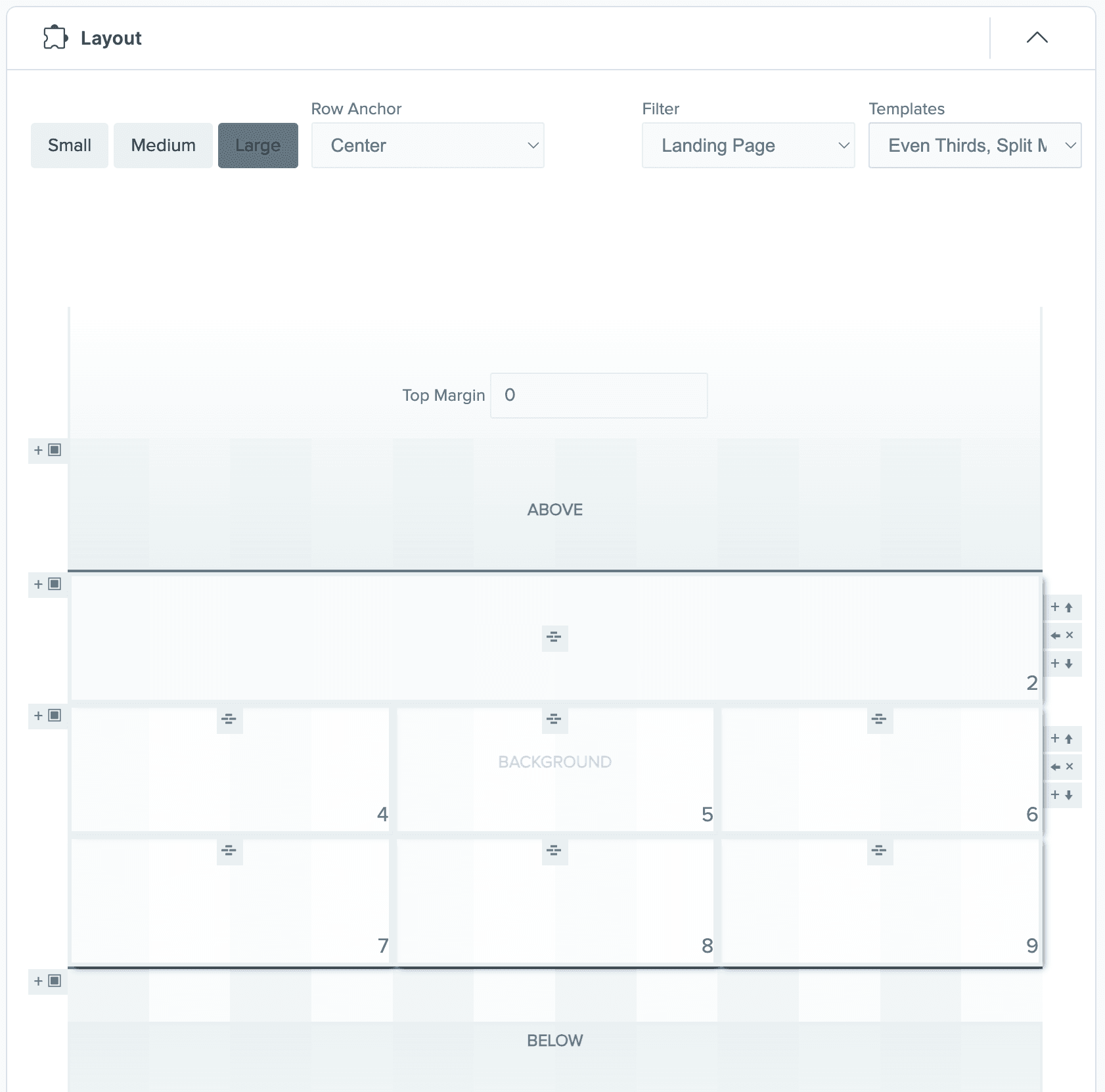
The result was the Master Module: a single, configurable Contentstack module that consolidated the 50+ legacy modules into one engine. Business users compose layouts from a responsive 12-column grid (with push/pull adjustments for centering), then place lockups — combinations of copy, media, and CTAs — into the grid slots. The same module can produce countless layouts; engineering never has to ship a new "module" again.
The legacy library wasn't 50 modules — it was 50 stalled requests. Recognizing that pattern is what unlocked the design. Once you see "every new module is a re-skin of the same five layouts with different content," the right system writes itself: a grid, a lockup primitive, and a config surface.
The demo is the live Master Module — try composing a layout and watch the JSON output update in the console.
Technical highlights
The hard part of any visual configurator isn't the UI — it's keeping the data model coherent as the user edits. Most teams reach for a state management library; this one ships its own. Three explicit state layers — a transient input buffer (data.options), persistent block state (data[area].rows.blocks.options), and an emitted output schema (data.output.layout) — with a one-way commit path between them. Validation runs against the transient layer, so an invalid edit never reaches persistent state. The output schema is rebuilt from scratch on every commit, with empty values omitted, so the schema is always the minimal representation of the layout. Same shape as Redux; built in plain jQuery in 2021.
(DOM event) → updateOptions() → data.options                [transient buffer]
                                       ↓
                                  validate()                [3-rule composite validator]
                                       ↓
                                  applyOptions()            [commit transient → persistent]
                                       ↓
                                  data[area].rows.blocks    [persistent block state]
                                       ↓
                                  updateBlock()             [regex-driven className mutation]
                                       ↓
                                  updateData()              [serialize → output schema]
                                       ↓
                                  data.output.layout        [emitted, empties omitted]
                                       ↓
storeData() [debounced persist]// The "commit" step — copies the transient buffer to persistent state
// only if validate() passes, then triggers DOM + schema updates downstream.
function applyOptions() {
if (!validate()) {
updateTemplates();
var blockOptions = data[data.options.area]['row_' + data.options.row]
.blocks['block_' + data.options.block].options;
for (var i = 0; i < data.loops.breakpoints.length; i++) {
for (var x = 0; x < data.loops.options.length; x++) {
var val = data.options[breakpoint][option];
if (!val && (option === 'padding' || option === 'margin') && breakpoint === 'sm') {
val = '0';
}
blockOptions[breakpoint][option] = val;
}
}
updateBlock(data.options.area, data.options.row, data.options.block);
closeOptions();
updateData(); // rebuilds data.output.layout from scratch, omitting empty values
}
}The processing flag (not shown) suppresses storeData() during bulk rebuilds — the same guard React's batched updates implement. The whole thing is ~100 lines of architectural plumbing that holds together a configurator with multi-row × multi-block × multi-breakpoint × multi-option state.
Most responsive frameworks use media queries to switch styling at breakpoints. This one inverts the pattern: the body carries a single class (.sm, .md, or .lg), and compound selectors decide which rules match at each breakpoint. The CSS itself implements the cascade — md styles automatically inherit to lg via duplicate selectors; lg-specific rules only fire inside .preview. The JS just sets the body class. The selector engine does everything else.
/* Width at each breakpoint — note md selectors also apply at lg by design. */
.span-sm-12,
.md .span-md-12,
.lg .span-md-12,            /* ← md inherits to lg automatically */
.lg .preview .span-lg-12    /* ← lg override scoped to preview */
{ width: 100%; }

/* Animation dispatch — TWO classes on the same element select keyframe + target. */
.animation-sm-top.animate-sm-text .text,
.animation-sm-top.animate-sm-background .background,
.animation-sm-top.animate-sm-both .text,
.animation-sm-top.animate-sm-both .background,
.md .animation-md-top.animate-md-text .text,
.md .animation-md-top.animate-md-background .background,
.lg .animation-md-top.animate-md-text .text,
.lg .preview .animation-lg-top.animate-lg-text .text
{ animation-name: top; }
Two patterns compose here. First, selector-based responsive cascade: the breakpoint hierarchy is encoded in the selectors, not the rules — so adding a new breakpoint means duplicating selectors, not rewriting any logic. Second, compound-class compositional dispatch: .animation-md-top.animate-md-text (two classes on the same element) selects which keyframe runs on which child. The author writes the JS-side data model with a direction and a target; the CSS combines them at runtime to pick the right animation. No JS branching, no class-name string manipulation in the runtime — just selector composition.